Saved by Tom Critchlow and
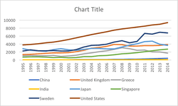
Remove the legend to become one — Remains of the Day
The most effective reports and presentations are simple, direct, and visualize data that asks the right questions and supplies answers. Invest time in training yourself about data visualization techniques. If you need inspiration, visit the New York Times Visualization Lab (http://zqi.me/nytvlab).
Avinash Kaushik • Web Analytics 2.0: The Art of Online Accountability and Science of Customer Centricity
1. Strive for graphical integrity2. Maximize Data Ink3. Avoid Chart Junk4. Aim for High Data Density5. Use Classic Design Solutions6. Apply Aesthetics & Technique
Anil Bas • Lessons from Edward Tufte
• Remove extraneous elements. Be aggressive. Take away as much as possible while maintaining the meaning. • Make all the elements support the visual. Use them to highlight the idea, not to describe the chart’s structure. • Remove ambiguity. Make sure each element has a single purpose that can’t be misinterpreted. • Use conventions and metaphors.
... See more