Dry cleaners guide for removing some common stains:
For blood stains, use hydrogen peroxide or a stain remover or liquid detergent with the protease enzyme (wash on cold please)
For oil stains, use a
surfactant like dish soap or liquid detergent, products with lipase work too... See more
VIDEO NOTES
FRANK LLOYD WRIGHT AND RACIAL HIERARCHY
REFERENCES: Wright, Frank Lloyd. An Autobiography. Horizon Press, 1943. Levine, Neil. The Architecture of Frank Lloyd Wright. Princeton University Press, 1996.
Your support at https://ko-fi.com/kelliesnider
... See more
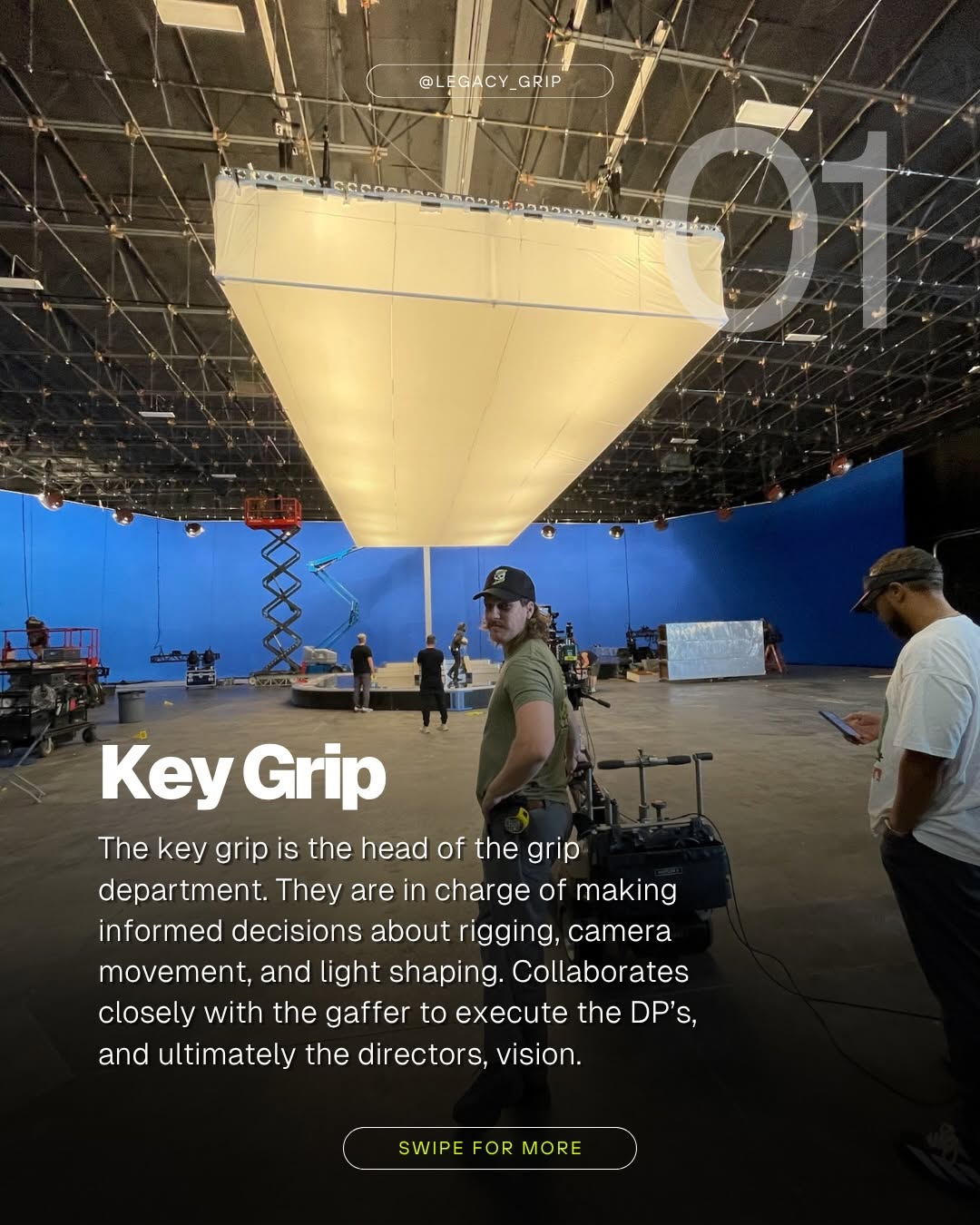
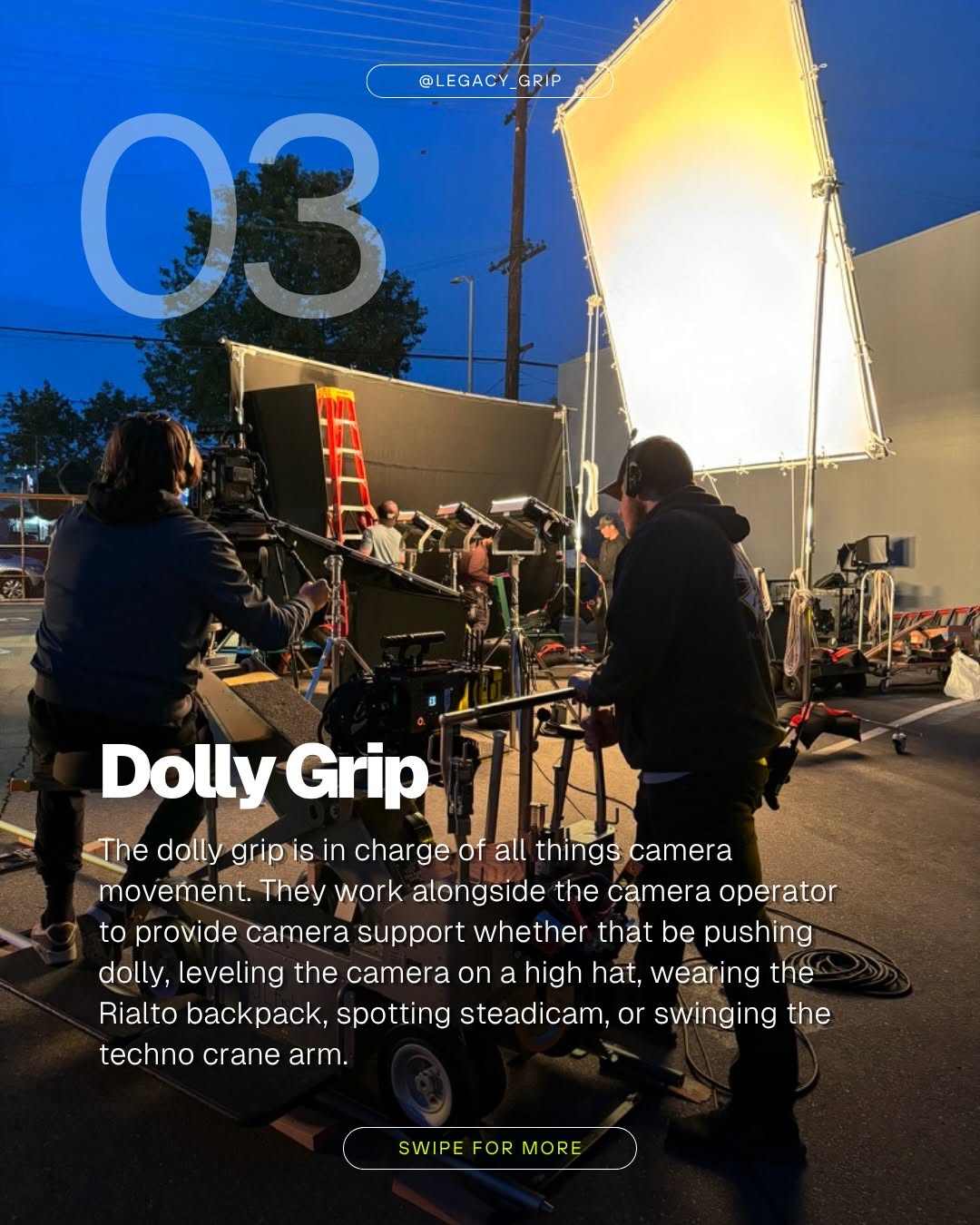
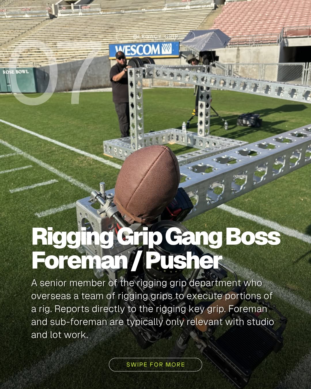
Grip Department Roles. Every film set relies on the grip department to make the shots happen. From rigging complex camera moves to supporting lighting setups, grips handle the equipment and problem-solving that keeps production moving.
Here’s a breakdown of the key roles:
Key Grip - Leads... See more
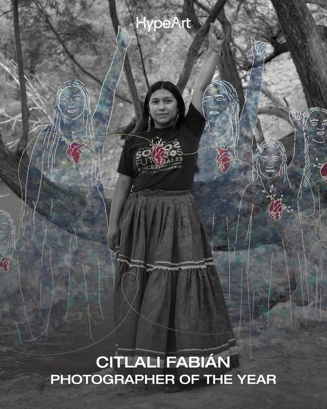
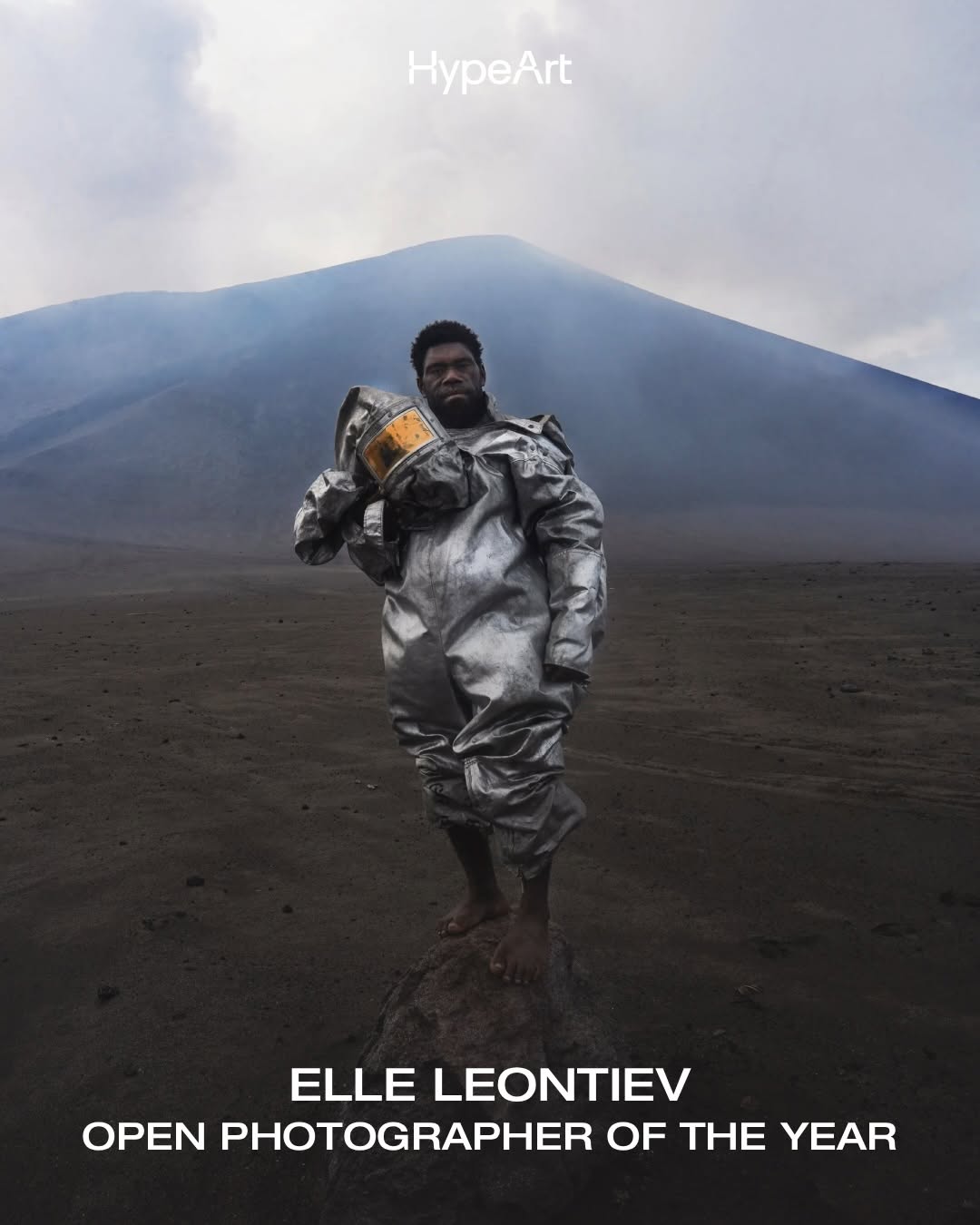
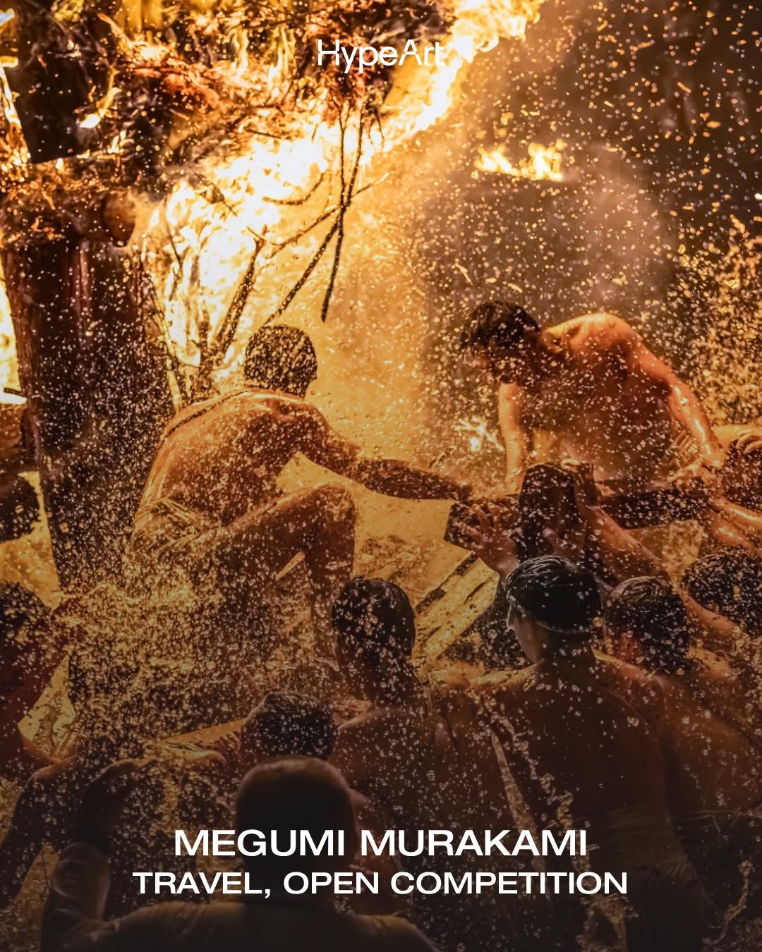
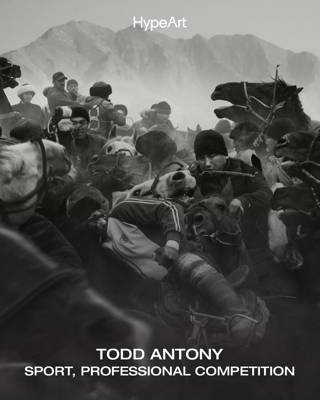
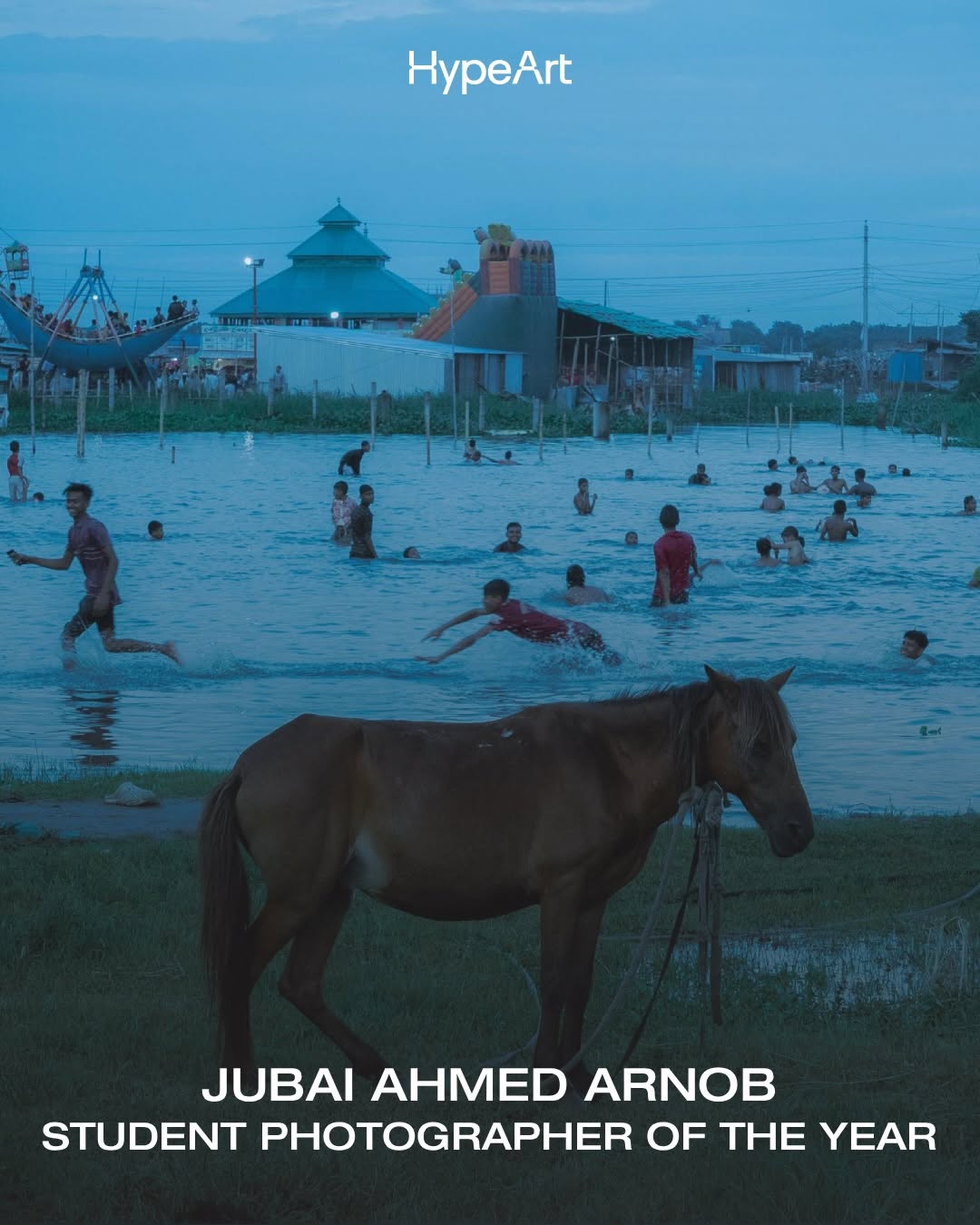
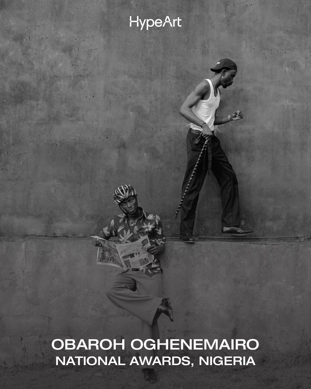
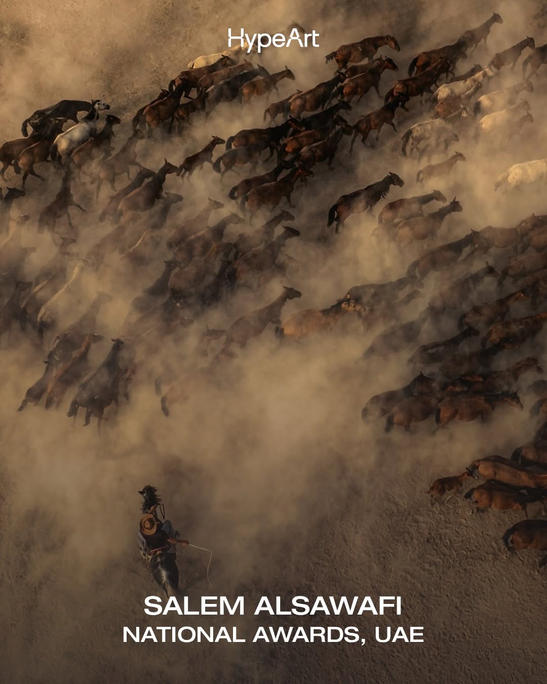
The winners of the 2026 Sony World Photography Awards have arrived. Chosen from a pool of over 430,000 images from 200 countries and territories, this year’s selections showcase the best across categories, celebrating photographers of all statures – from under-19’s to legends in the medium.
Mexican artist and... See more
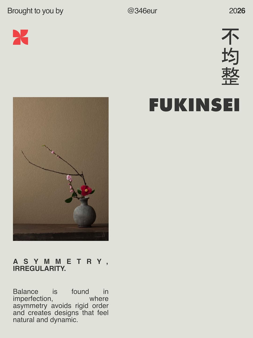
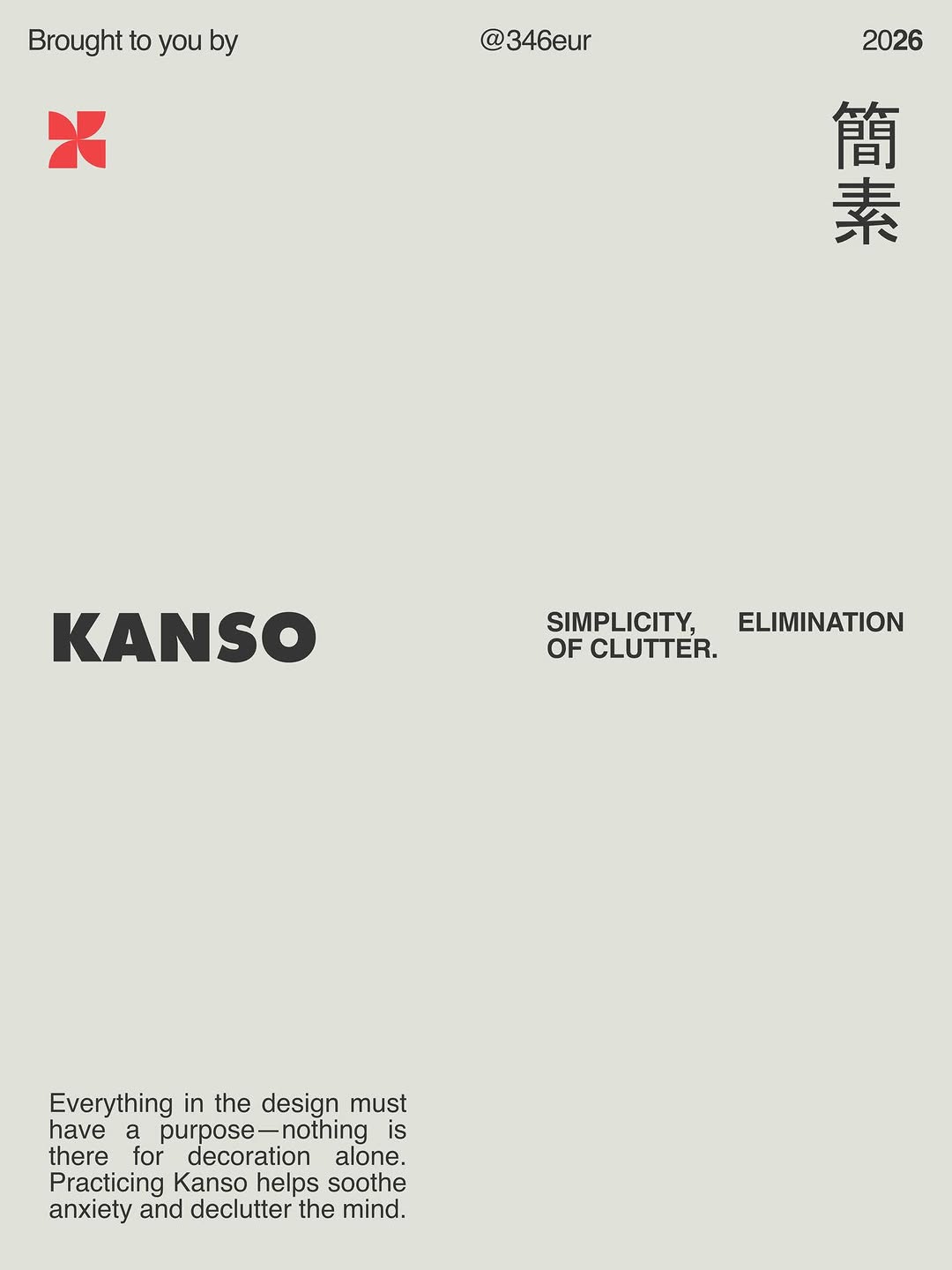
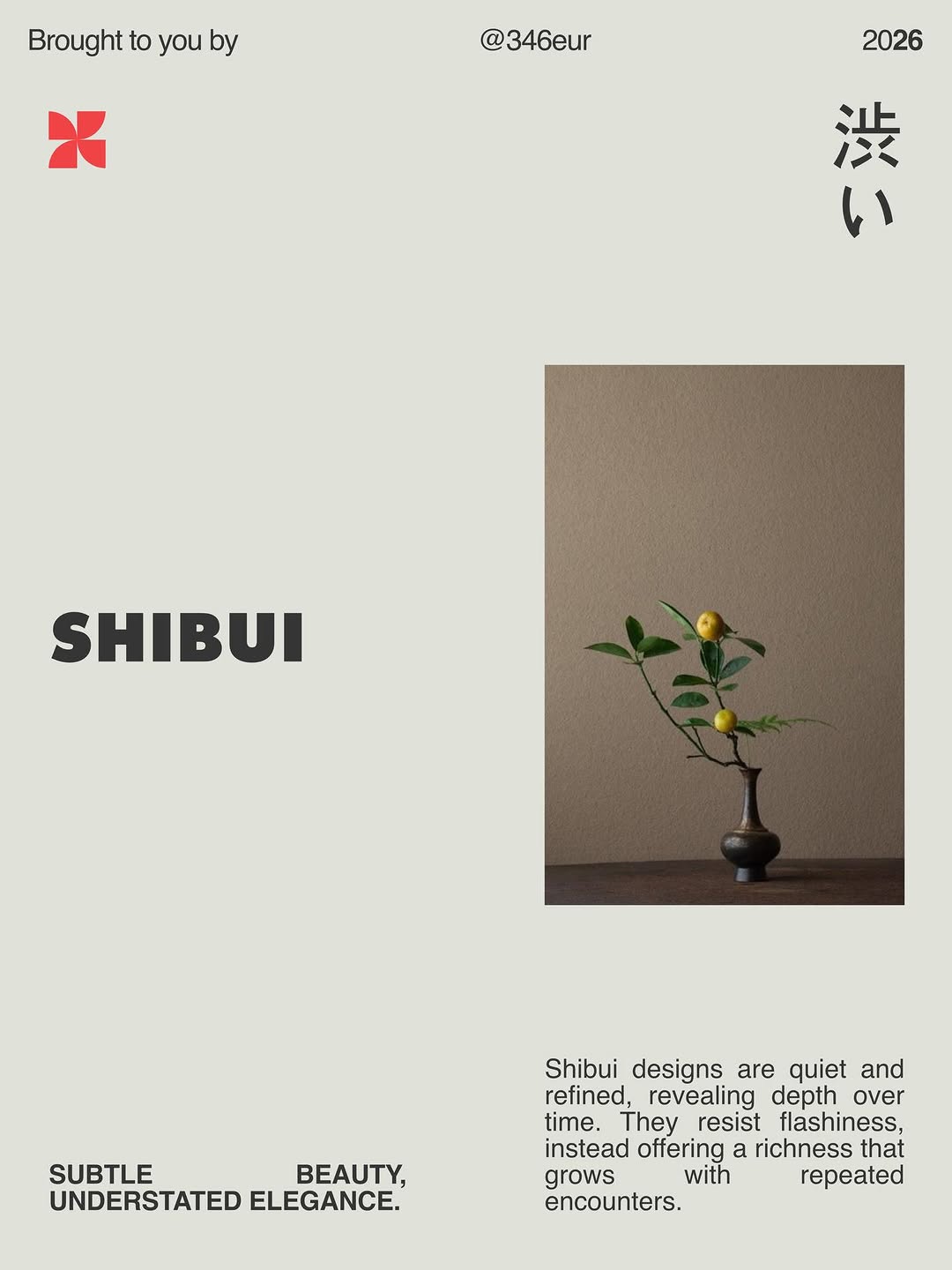
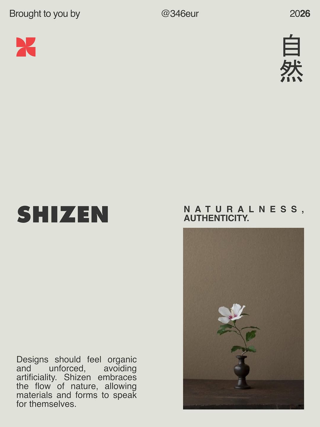
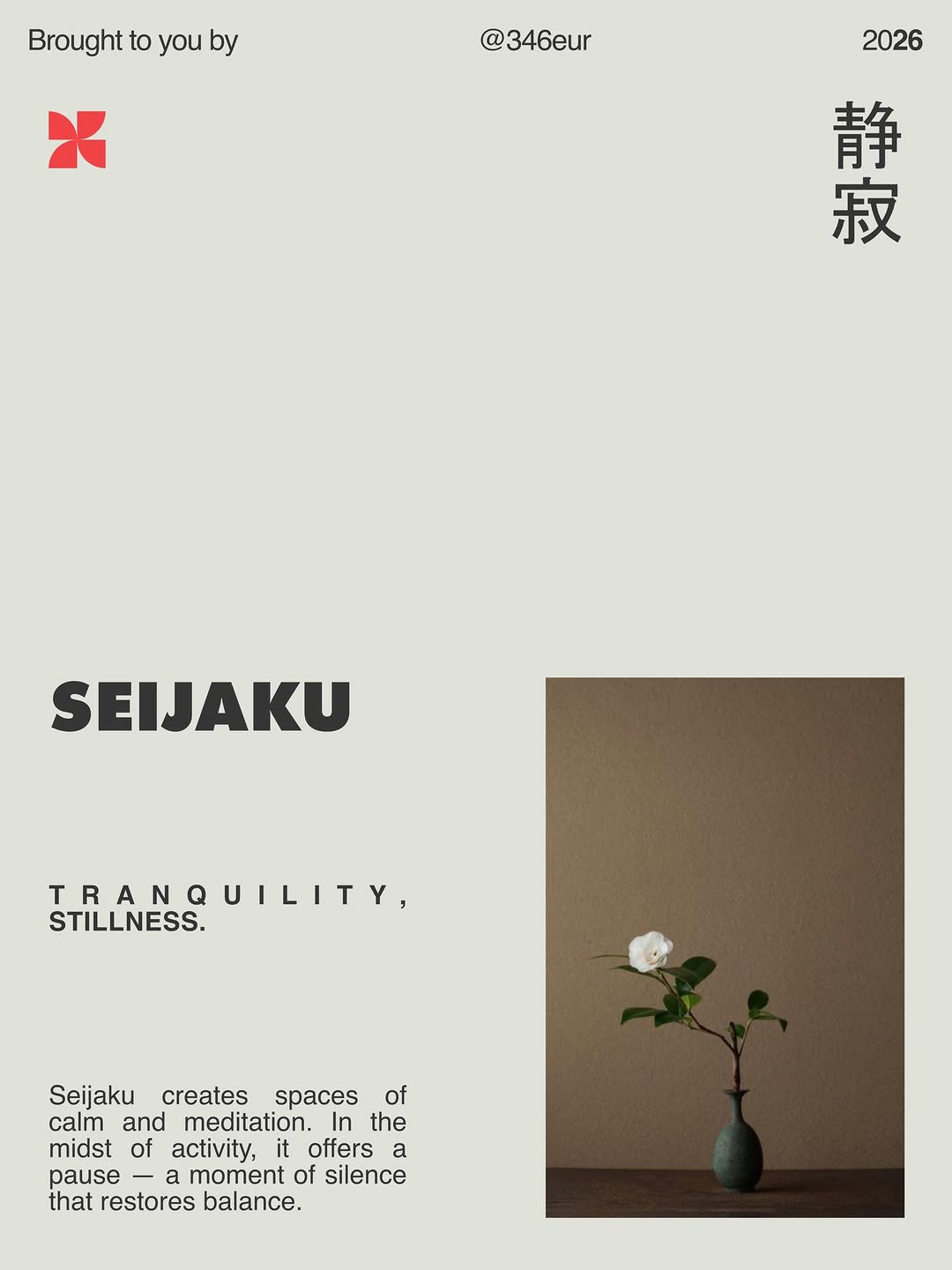
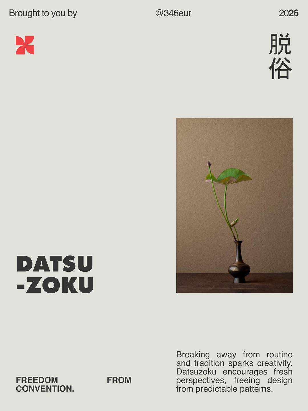
7 Japanese Design Principles
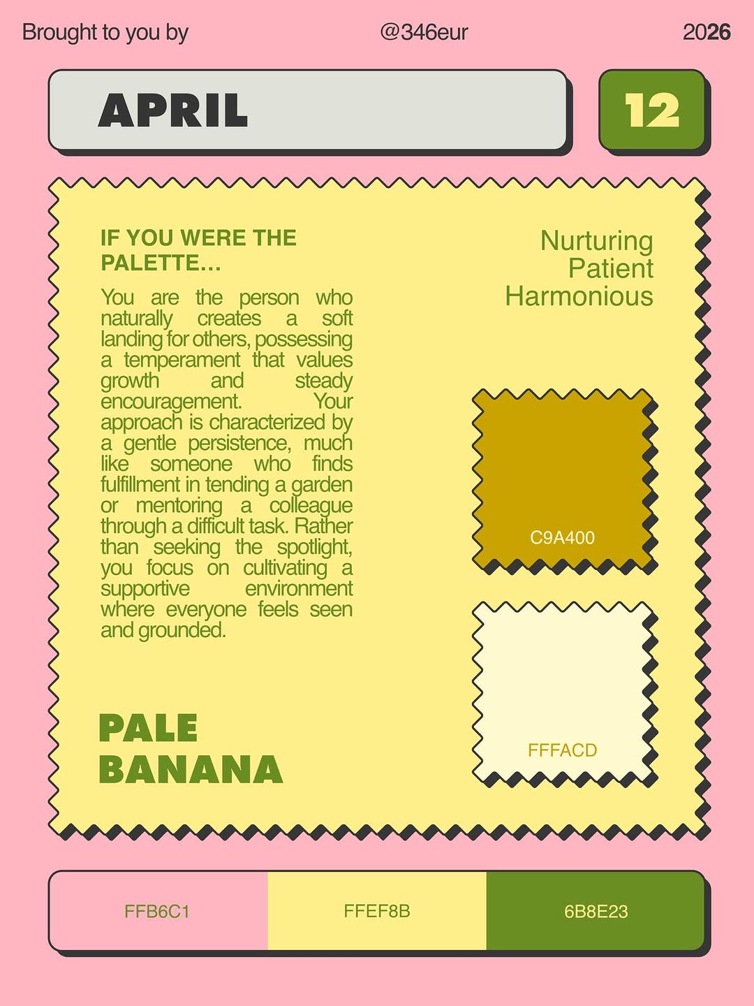
📕 Palette By Day!
A book that explores 366 personalities through unique color palettes — one for every day of the year.
Curated journey of colors, moods, and identities for designers, stylists, artists, and anyone who sees the world in... See more