visual design
In 2011, Sangwon Lee and Richard J. Koubeks showed that the effect of aesthetics factor on pre-use preference was significantly different based on cognitive styles.[2] There were significant differences in the pre-use preference of the changing aesthetics but not between the two types of cognitive styles of the test subjects. The same applied to... See more
Masaaki Kurosu • Aesthetic–usability effect
This was surprising at first, but when you think of type as graphics, visuals. You can reason that even Wholist-Analytical and Visual-Verbal are both affected by by aesthetics.
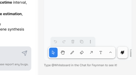
informing the user or giving the user control of when the AI can see something feels like a good move.
better control
ease of use w/o worrying about what to put on the white board (tbd after using it a bit more).
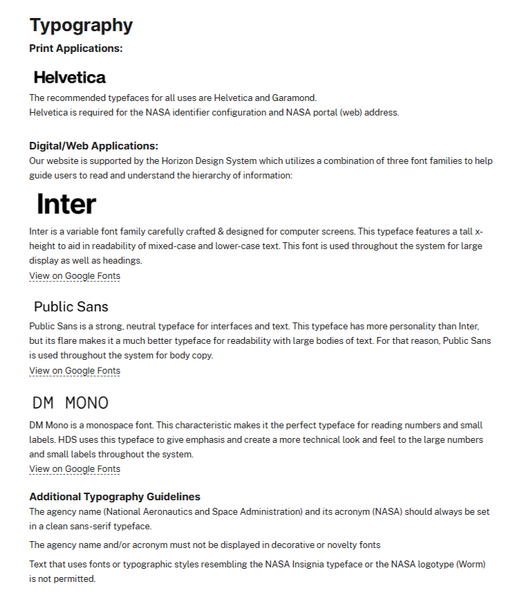
NASA uses Helvetica for print and a combination of 3 typefaces – Inter, Public Sans and DM Mono.
The 3 typefaces are part of the Horizon Design System.
All OS fonts except Helvetica.

I like the header showing the brands/products with their logos.
It feels more natural and has personality.