
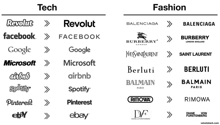
Notice how logos recently all look the same? Not because it makes them look better... But because of THIS psychological trick that manipulates your brain. That's why Google, Microsoft, and Airbnb are all doing it. Here's the full explanation:đź§µ https://t.co/R5R1ys44f3

Libby Marrs • Post-Authentic Sincerity a Premium Generic Essay
The Thought Leader Gold Rush
dotdottdottt.substack.com
I don’t know if we have a word for when leitmotifs happen visually—maybe “motif” is the closest we have—but this happens all the time in great pieces design, most often in brand identity work and art direction. Think: Lyft’s pink. Nike’s use of Futura Extra Bold Condensed. The Burberry check pattern. Motifs aren’t just aesthetic choices; they’re si
... See moreDesign so that the salient cues are obvious.
Weinschenk Susan • 100 Things Every Designer Needs to Know About People (Voices That Matter)
visual appearance, whether we’re talking about a person or a logo, sends two kinds of signals. The first signal states, “I’m like this as an individual, and this is the group that I fit in, so I share qualities with the members of that group. And I like that.” The second is, “This is what gives me pleasure as an individual.”
Debbie Millman • Brand Thinking and Other Noble Pursuits
And when the website is designed with GeoCities and flashing GIFs . . . If you remind me of a scam, it will take a long time to undo that initial impression. That’s precisely why so many logos of big companies look the same. It’s not laziness. The designers are trying to remind you of a solid company. That’s the work of “reminds me of.” You can do
... See more