Visual Inspiration
The Art Collective - El Nido @artcollective.elnido
instagram.com
The Trends Defining 2025
The content outlines design trends for 2025, emphasizing authenticity, emotional resonance, and innovative visual storytelling, while showcasing photography styles that engage audiences and break away from hyper-polished aesthetics.
res.cloudinary.comtypo/graphic posters
typographicposters.com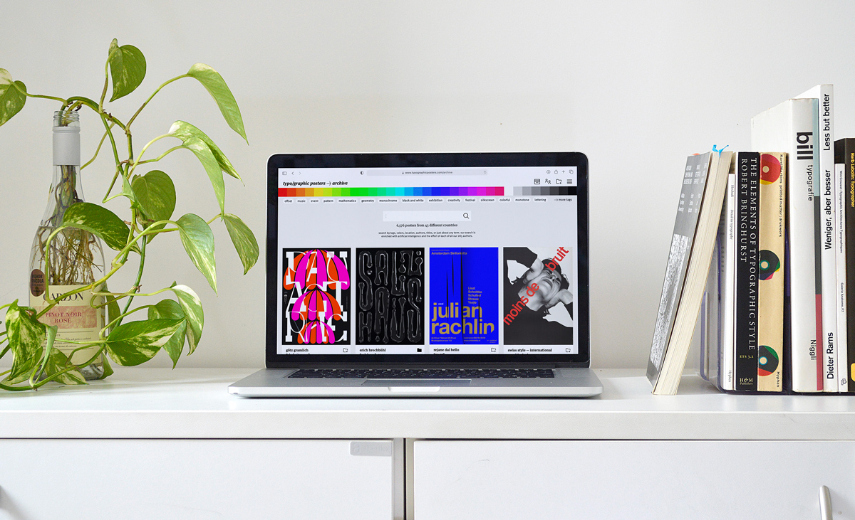
typo/graphic posters
•coverjunkie.com
•eyecannndy.com
•flim.ai
•typographicposters.com
•are.na
•eyecannndy.com
•flim.ai
•typographicposters.com
•are.na
Video
Visual archive site

ManvsMachine
vimeo.com
Volkskrant Magazine - Coverjunkie
coverjunkie.com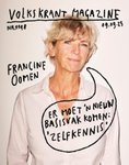
explore modern graphic design trends for inspiration | Motion design animation, Motion graphics design, Graphic design inspiration
uk.pinterest.com
Takamitsu Motoyoshi
photoyoshi.com