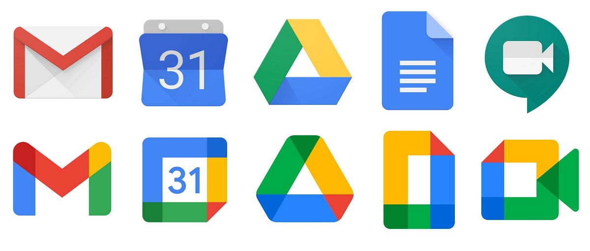
Everything Looks The Same
exploring the endless forces luring towards conformity and sameness
sari and
Everything Looks The Same
sari and

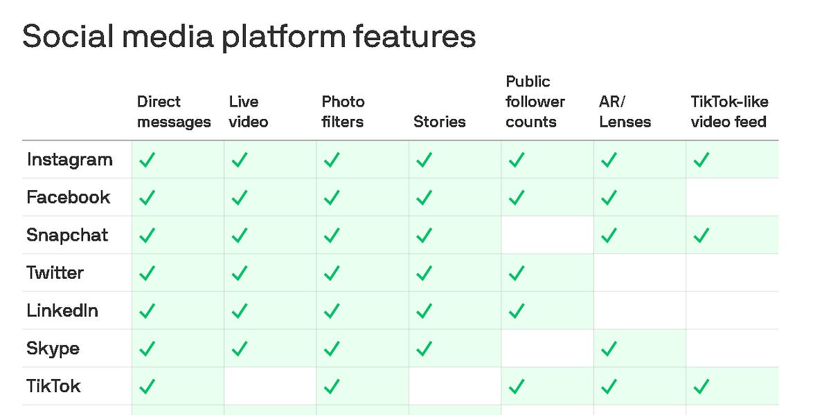
this examples why tiktok, spotify, instagram, and twitter all start to look the same - pivot to video, stories, etc…


Develop an eye to know when to break away from consistency