Brands
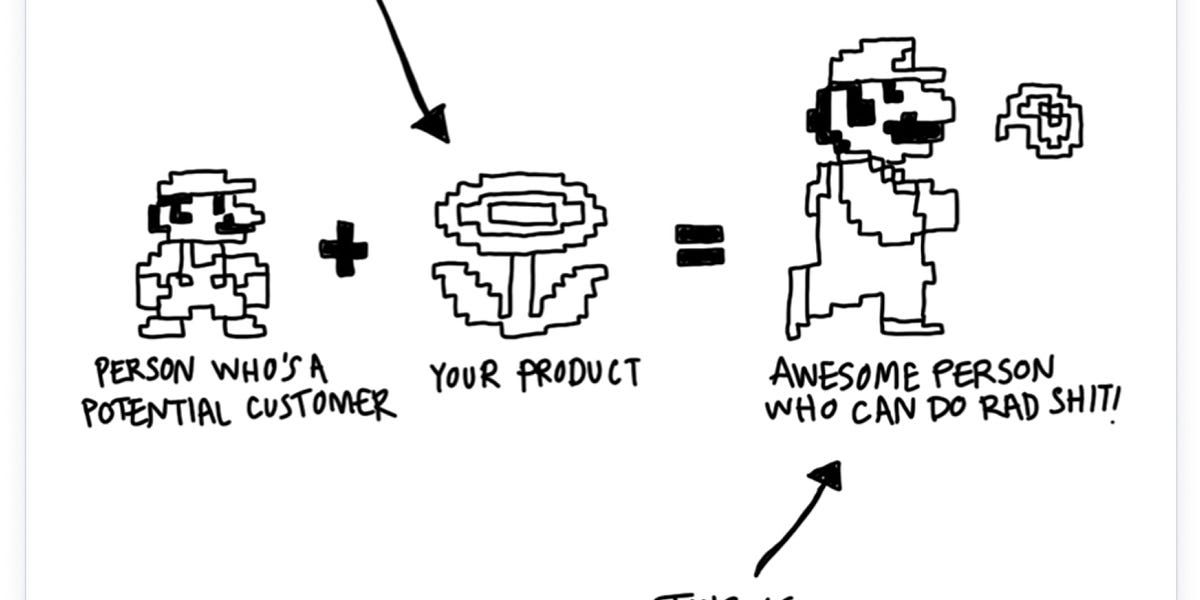
“What if there were two versions of the landing page and you could toggle between them? One side would be the SaaS version—features, pricing, the practical stuff. The other side would be the soul of Sublime—the why, the feel, the philosophy.”
“Women asked for clear, no-nonsense literature about how cars worked and what to do when something went wrong; the auto industry gave them cartoonish pamphlets that suggested applying lipstick and “looking helpless and feminine” when needing to change a tire. When women protested that they wanted roomy trunks and adjustable seats, the industry... See more
Jessica Brockmole, “Pink Cars and Pocketbooks”
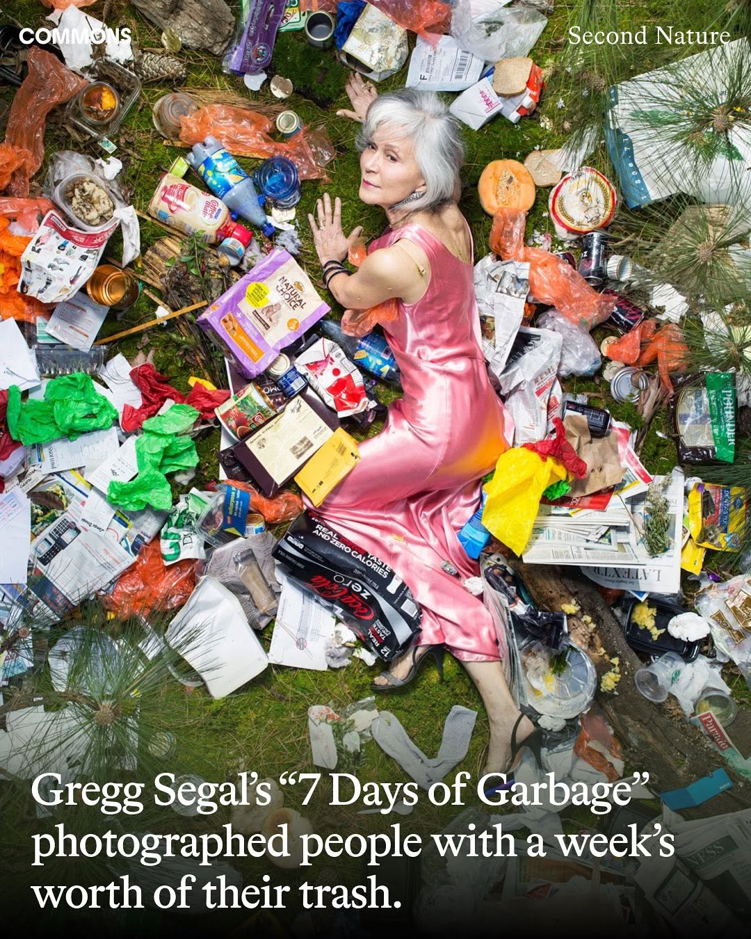
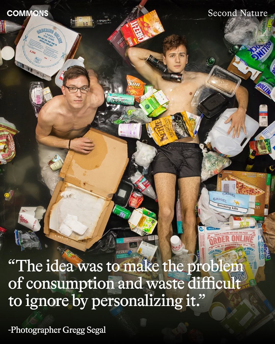
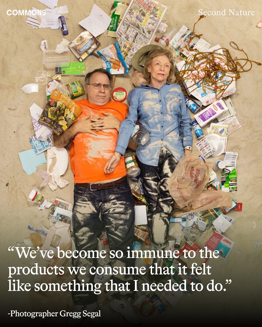
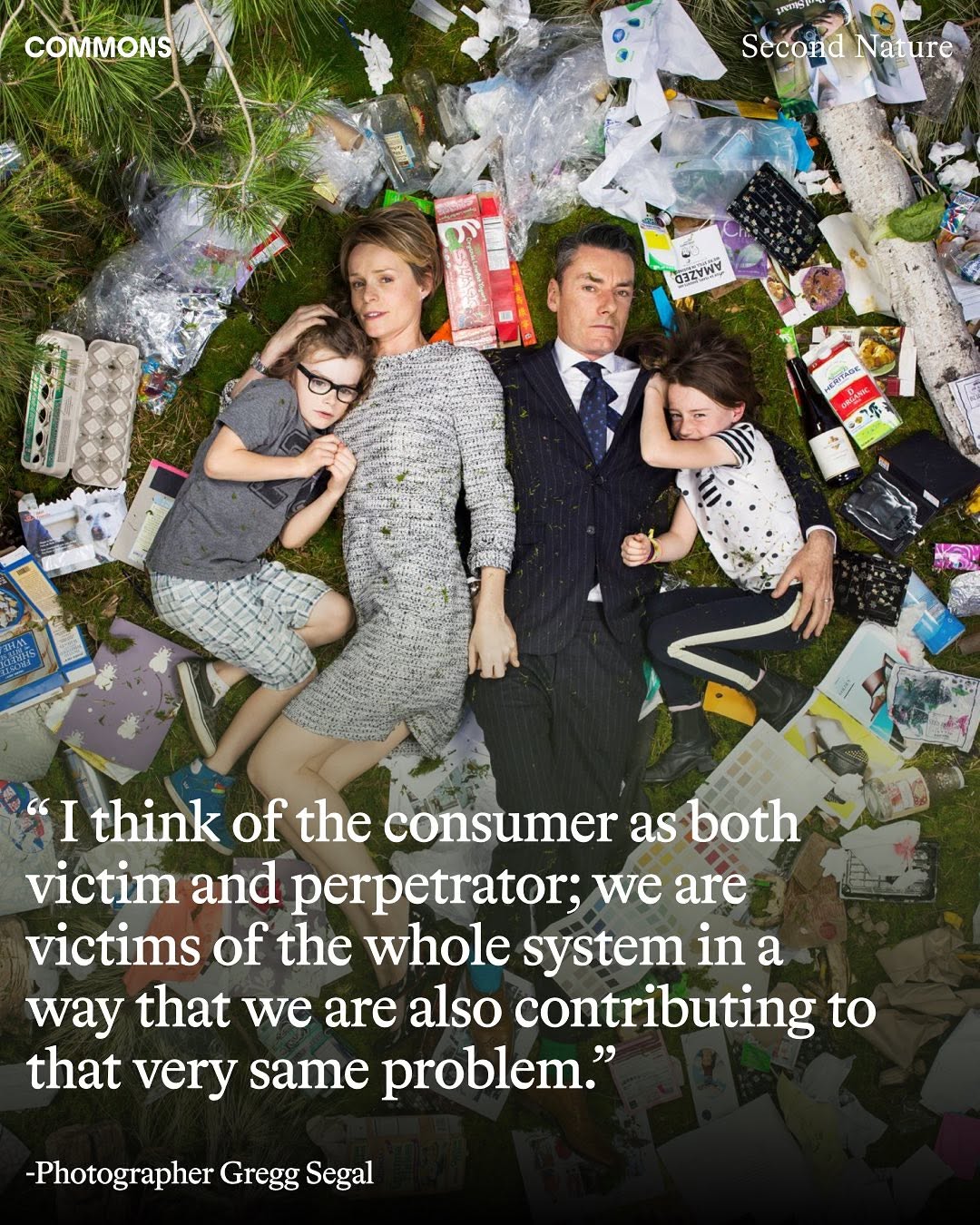
In Pasadena, California, photographer Gregg Segal embarked on a project capturing individuals from diverse backgrounds and ages within his garden. Utilizing three distinct settings - water, beach, and forest - Segal juxtaposed each subject amidst a week’s accumulation of their waste. Participants were tasked with gathering and preserving all their... See more
instagram.comRisk is expensive, and it does not figure into P&L. When the pressure is to show YoY growth on the quarterly basis, as is the case of the publicly traded companies, or when expectation is to deliver wild returns in case of PE-backed ones, no one wants to make anything remotely surprising or different. Prada is able to put forward fearless... See more
Ana Andjelic
Faulty as they may be, snap judgements overpower decision-making. Processing complexity of any person, choice, or a situation is time consuming and resource-draining. Snap judgements simplify the world. A very few people have the time or the attention to sift through the entirety of culture.
Ana Andjelic
“Most decisions should probably be made with somewhere around 70% of the information you wish you had. If you wait for 90%, in most cases, you’re probably being slow. Plus, either way, you need to be good at quickly recognizing and correcting bad decisions. If you’re good at course correcting, being wrong may be less costly than you think, whereas... See more
Billboard's 2024 year-end analysis: 82% hit songs now use one of just four melodic structures that have previously proven most successful by the algorithm. Spotify's year-end data: the average similarity score between Top 100 tracks reached an all-time high.
BoF x McKinsey's State of Fashion 2024 report: 71% (sure…cash-strapped, low-growth) fashion... See more
BoF x McKinsey's State of Fashion 2024 report: 71% (sure…cash-strapped, low-growth) fashion... See more
