Thumbnail: https://b.thumbs.redditmedia.com/N7BBHCloSAF9Y1X6_zr3K-lt2t6gIXLG9lo5zCC35tA.jpg
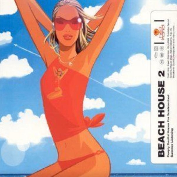
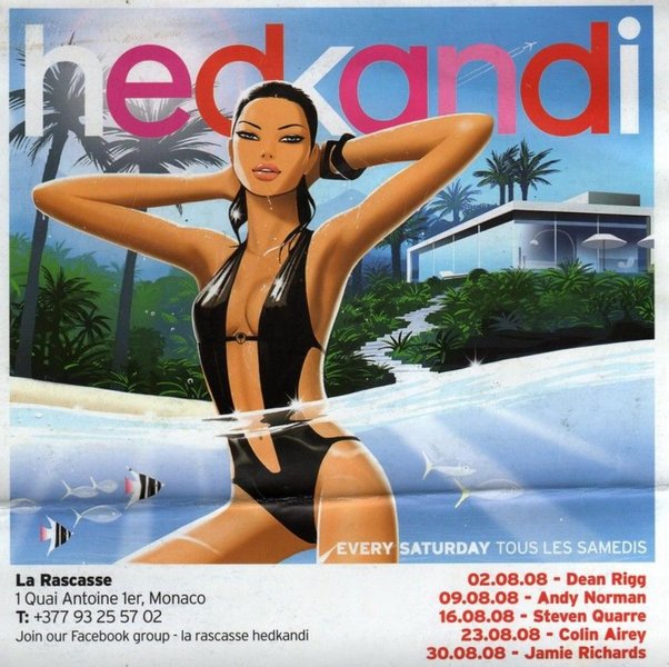
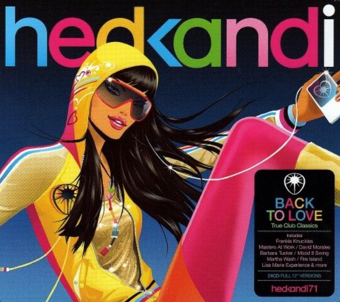
Secure-Bar-2511reddit.comBranding has regressed
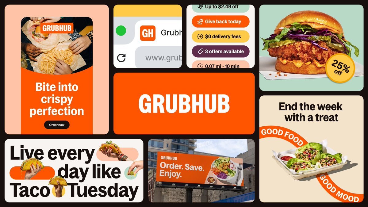
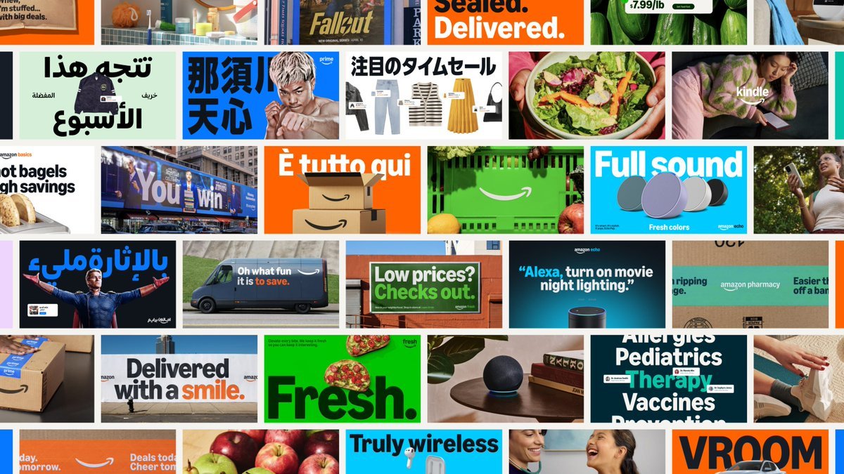
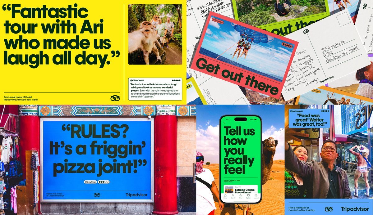
Have we coined a term for this kind of type-forward, multicolor, large-scale corporate rebrand style yet? https://t.co/Y1IHBu92ZH
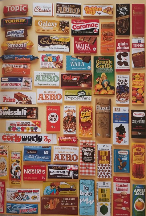
Stumbled on this collage of 70s chocolate bars and had to stop and admire the typography.
The Curly Wurly logo, especially. It’s pure joy in letterform. Swirly, fun, and unfiltered by “brand guidelines.”
There’s something about that era - bold, weird, and full of character.... See more
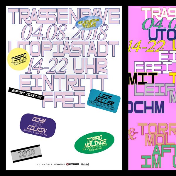
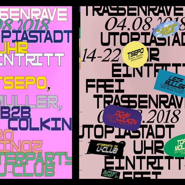
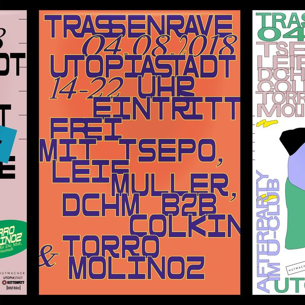
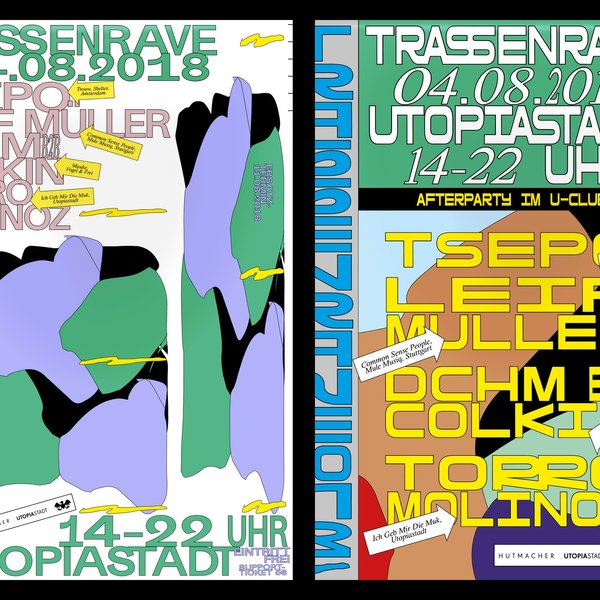
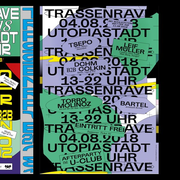
Archive material: Poster drafts for a rave at @utopiastadt_wuppertal from 2018. Totally forgot they existed. Feel a bit outdated now, but actually really like how they turned out 🤓
#graphicdesign #posterdesign #customtype #typography #grafikdesign #grafikfeed #thedesignblacklist #certainmagazine #fruitsartclub... See more
instagram.com