Inactive GUI Controls: Show, Disable, or Hide?
Whenever possible, I try to keep buttons and features in their default state — enabled , accessible, and legible. When a user interacts with that feature, we can explain why they can’t use it, how to enable it, and how to keep it enabled. Possible exceptions are confirmation codes and loading/processing states.
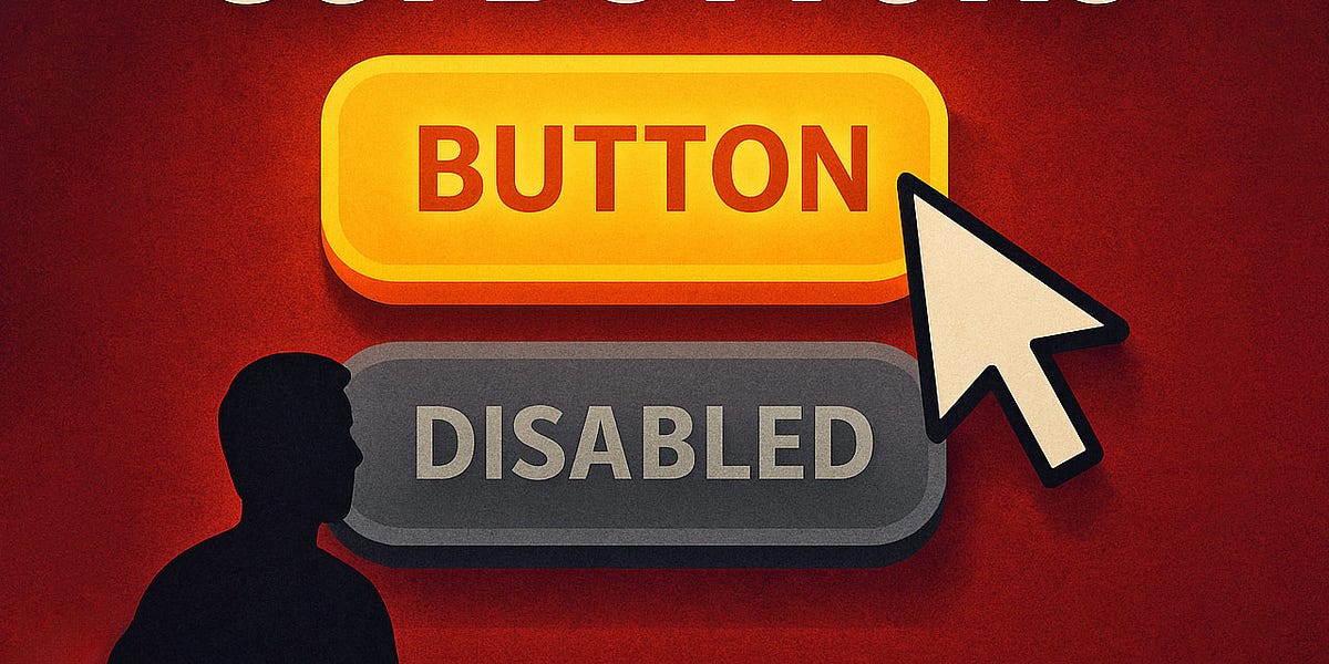
Hidden vs. Disabled In UX — Smashing Magazine
Disabling buttons can cause more problems for users than benefits.
Missing feedback
When you click a disabled button, nothing happens. The button doesn’t explain what’s wrong or help you fix the problem. It provides no helpful feedback. If the user thinks their answers are correct, not providing feedback can make the UI feel broken.
Missing focus
Disab
... See moreManuel Matuzovic • Web Accessibility Cookbook
Having the primary action on the left before the secondary action is considered better by some designers because it is closer and, therefore, easier to click. This makes sense, but you cannot ignore the fact that users will look at all of their options before choosing which action to take. As they function like pagination buttons, 'Ok' and 'Cancel'... See more