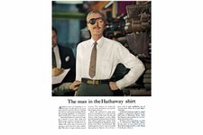
History of advertising: No 110: The Hathaway man's eyepatch
History of advertising: No 110: The Hathaway man's eyepatch
campaignlive.co.uk
Related
Insights
Images
3
3
Nobody reads ads. But write ads in a way that feels new (And relatable ), and people will read every word.
A little corner of the internet to find old and new print and outdoor ads + ONE thing each ad does well.
16
16
A little corner of the internet to find old and new print and outdoor ads + ONE thing each ad does well.
nobodyreadsads.com
8
8
https://preview.redd.it/words-of-wisdom-from-david-ogilvy-the-father-of-advertising-v0-pnfe1ic3x14e1.jpeg?auto=webp&s=2065349934c0e56d9e7fbc0272283bece0ccf5bd
Reddit
reddit.com
Unlock unlimited Related cards