A Guide on Page Design, White Space, and Readability


The opportunity lost by increasing the amount of blank space is gained back with enhanced attention on what remains. More white space means that less information is presented. In turn, proportionately more attention shall be paid to that which is made less available. When there is less, we appreciate everything much more.
John Maeda • The Laws of Simplicity (Simplicity: Design, Technology, Business, Life)
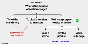
A classic offence that plagues many designers and non-designers alike is the overabundance of elements in a design. While making use of all available space might reduce canvas size and scroll distance, it does more harm than good when it comes to a viewer’s understanding of information. Overcrowding will render a design impenetrable. The white spac... See more
White Space – Carl Barenbrug
of white space, so your page doesn’t look crowded. For headlines and sub-headlines, try fonts like Impact, Tahoma Bold, and Helvetica Bold.