Sublime
An inspiration engine for ideas

Maybe that's what this essay is really about: the journey from "What will this say about me?" to "What does this want to become?" From "How can I prove I'm good enough?" to "How can I be present enough to do justice to this moment, this challenge, this opportunity to engage with something larger than my own small anxieties?"
stepfanie tyler • thoughts on ego involvement and the weight of being
Why the most profitable creators in 2026 will be identity-shapers, not experts
Iva G. Biz + Human Designopen.substack.com
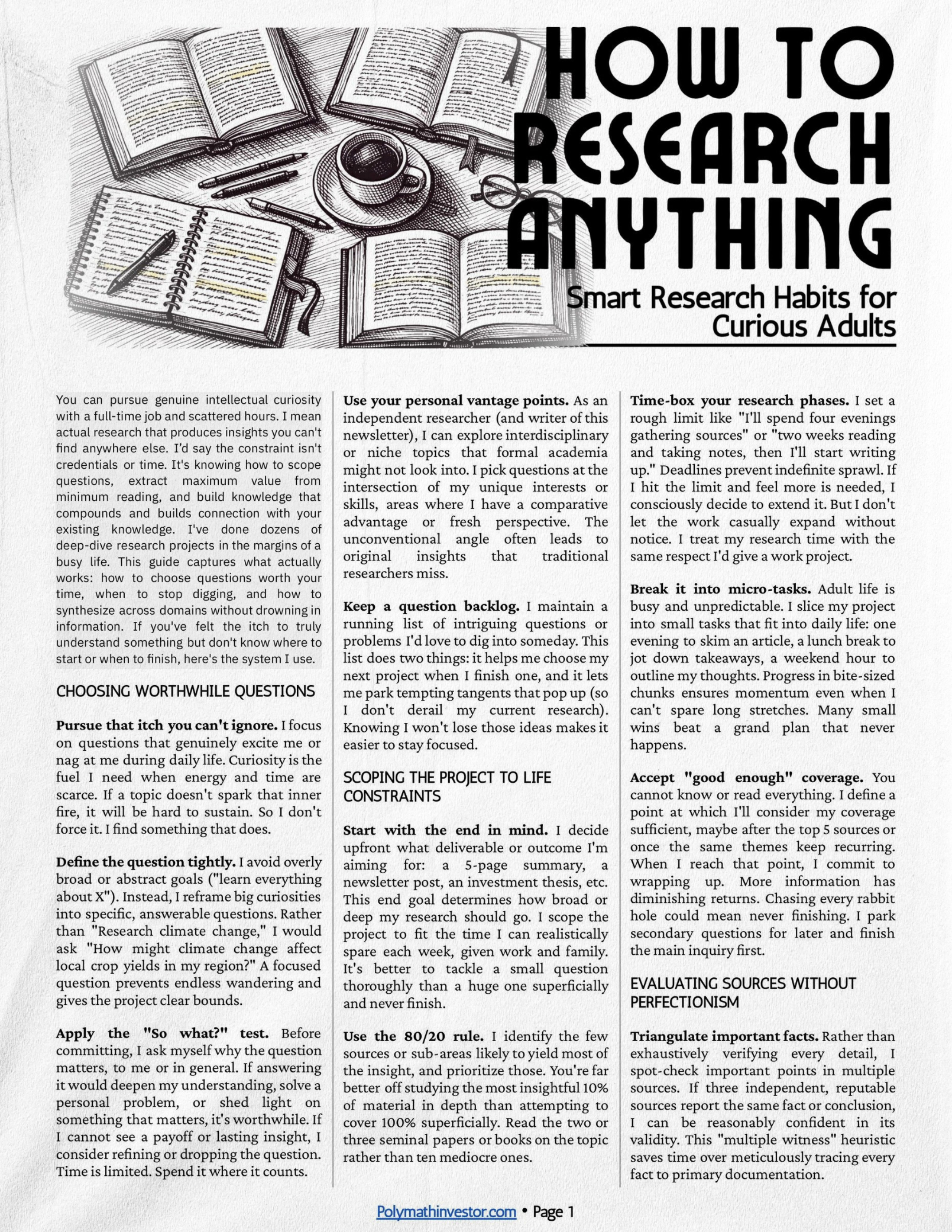
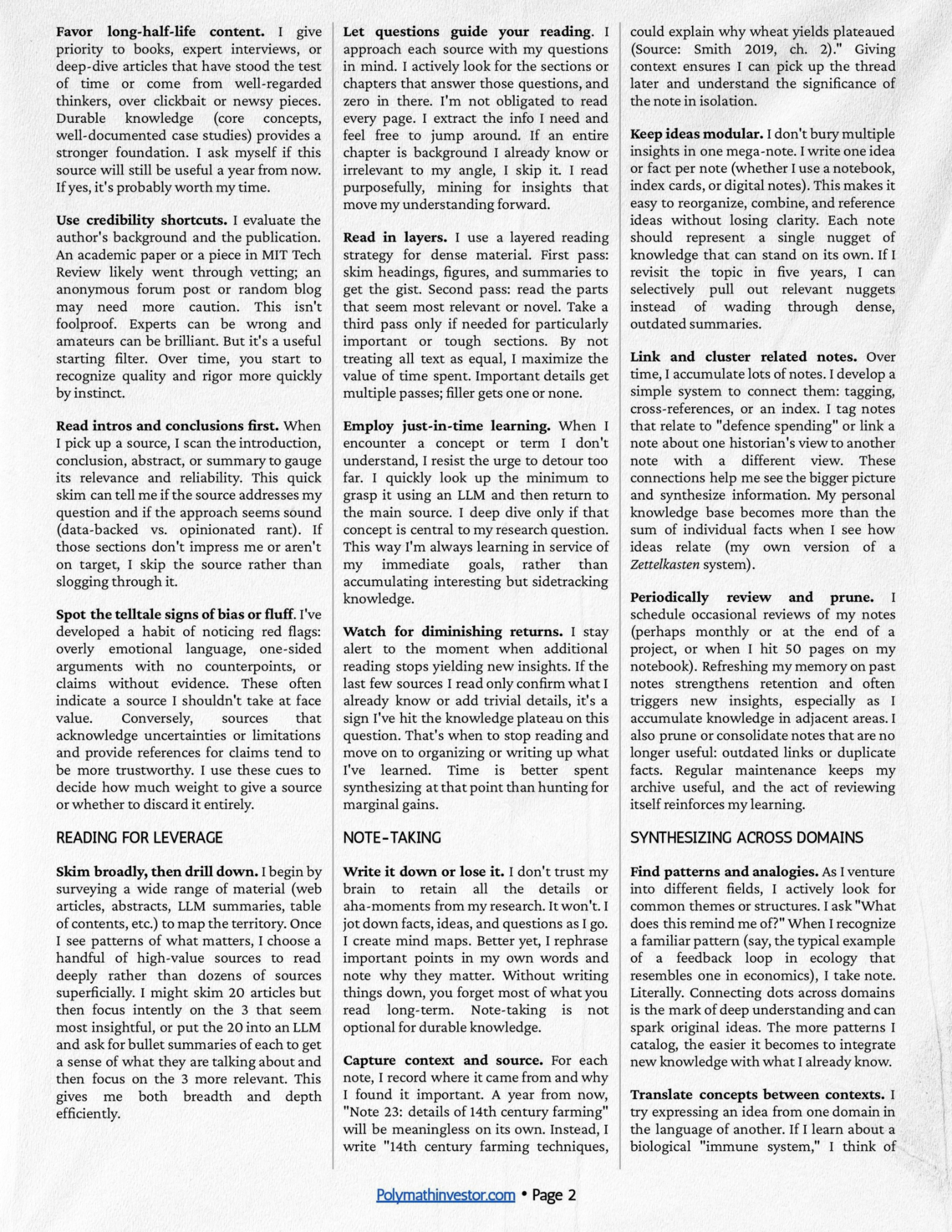
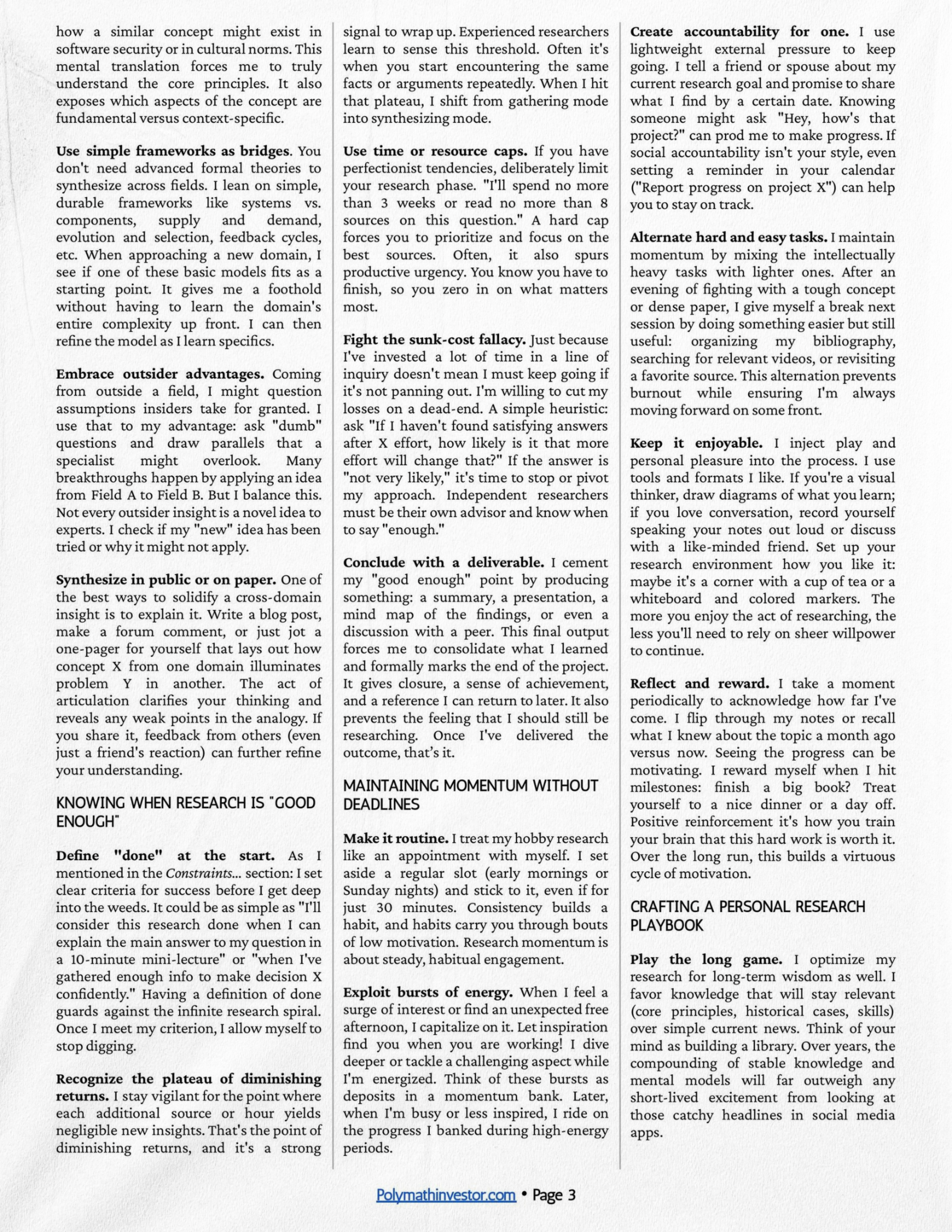
Many of you have asked about my research process. Here, I’m sharing some of the best practices I’ve picked up over time on how to research just about anything.
I’ve tried to keep it as general as possible so it’s not limited to investment topics.
Hope it helps!
Polymath Investorsubstack.com
