Sublime
An inspiration engine for ideas


Explorations of graphs, colors & shapes 〰
instagram.com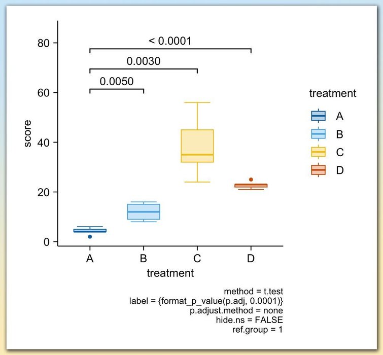
Adding statistical test results directly to your plots is a powerful way to make your findings clear and accessible at a glance. With tidyplots, functions like add_test_pvalue and add_test_asterisks make it easy to display p-values or significance levels on your charts, helping viewers quickly understand the statistical differences between... See more

5. Learn Python
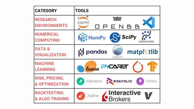
Python Quant Stack is 100% free (and covers data, analysis, research, backtesting, and execution):
OpenBB $0
Pandas $0
NumPy $0
Zipline $0
AlphaLens $0
VectorBT $0
Riskfolio... See more
Datavizzes
Kalmir • 1 card

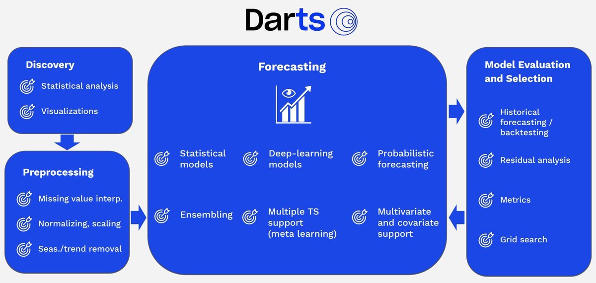
Python has some insane Time Series Forecasting libraries.
Let me introduce you to darts: https://t.co/hPyCKuJwFI
Data Visualization
Nicolay Gerold • 5 cards
Playing with a different treatment for the @linear blog illustrations... https://t.co/IVCKh4U9tO
Paul Macgregorx.com