Sublime
An inspiration engine for ideas
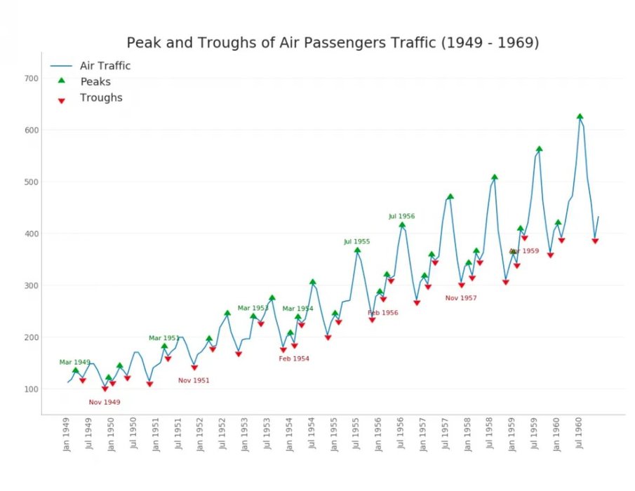
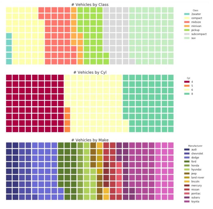
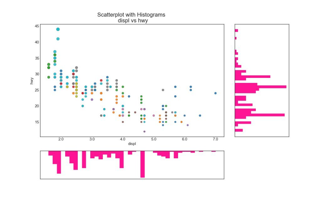
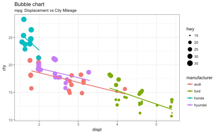
Top 50 Visualization Plots in Matplotlib and ggplot2
Correlation · Deviation · Ranking · Distribution · Composition · Change · Groups
Matplotlib https://t.co/7gPYeuCwOJ
ggplot2 https://t.co/XV3P8mbp4h https://t.co/N2YaQ1Mw3T
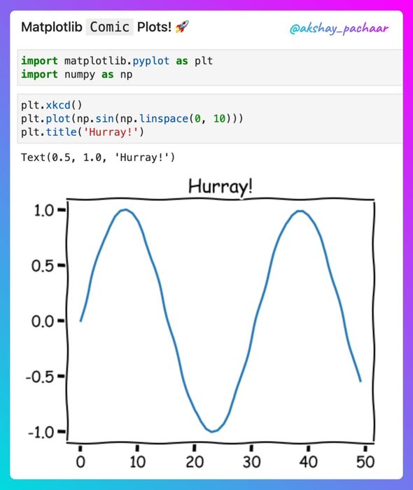
Style your Matplotlib plots like Randall Munroe's comics: https://t.co/1yUhtJcMMa
@KonradWagstyl @mathrip3 @ulyssespopple @niksirbi @tffunck @NPRougier Cool!
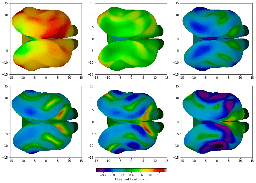
We've been using @NPRougier's https://t.co/EKW6WQpdEU for plotting our surface data. Here's an example: https://t.co/LMNb48MAtt
Why python is insane for algorithmic trading:
1. Visualization: Plotly ($0)
2. Data analysis: Pandas ($0)
3. Market Data: OpenBB ($0)
4. Technical indicators: TA-lib ($0)
5. Machine Learning: Scikit Learn ($0)
Total cost: $0... See more
👉https://t.co/Pi23Lh33Jy
Plus de 500 techniques de visualisation de données en Python, accompagnées de leur code source pour les reproduire chez vous 😍 https://t.co/2CWIGSvpYN
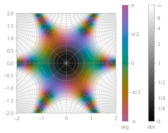
cplot, the @matplotlib package for plotting complex-valued functions, now has nice color bars. Some fixes for the contours have also landed.
The below function is sin(z^3) / z (if you haven't already guessed it 😉).
More fancy plots over at https://t.co/SbyHoZo0UN. https://t.co/cxtqXERkRE
