Typography
book = landscape.
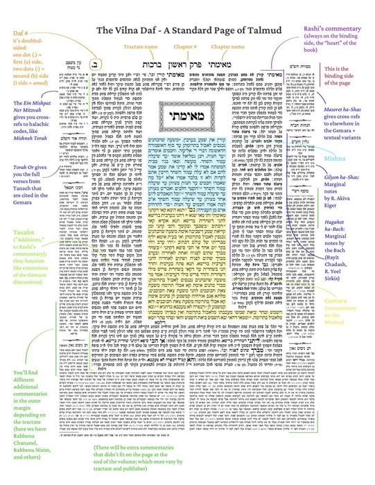
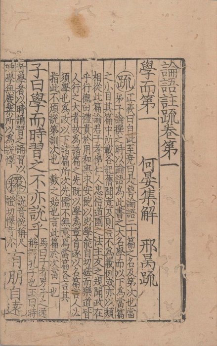
the layout of the talmud and chinese classics feels like geological strata - generations of commentary layered around or next to a core text.
tamuld: radial layers
the analects (論語注疏)): different font sizes and columns -> different writers https://t.co/Ga4MAqbO0i
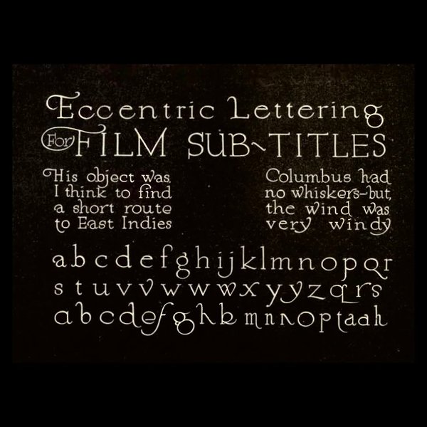
A plate from the 'Gordon Book Lettering for Commercial Purposes'. In this handbook, published in 1918, William M. Hugh Gordon lists a multitude of letterings already present in American culture, particularly in advertising environments. Nine pages are explicitly devoted to intertitles (‘Motion Picture Titles and Their Preparation,' pp.... See more
instagram.com


