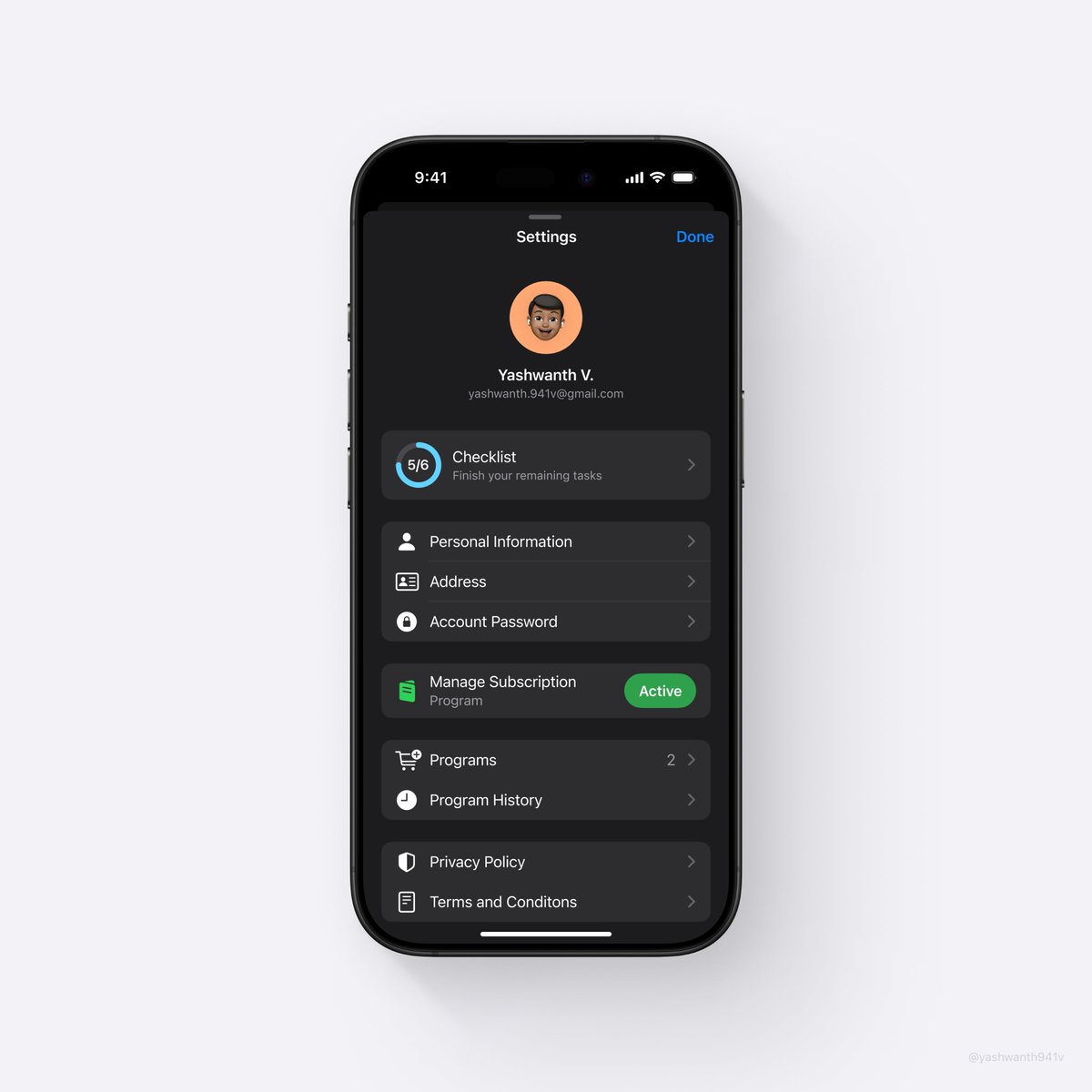
Settings Screen UI - Based on HIG https://t.co/vvNgKEORdL
I also spent time aligning labels, icons, and buttons, both vertically and horizontally in the sidebar and tabs. It was definitely a challenge given the amount of UI elements we have on this tiny surface. This part of the redesign isn’t something you’ll immediately see but rather something that you’ll feel after a few minutes of using the app.
Karri Saarinen • How we redesigned the Linear UI (part Ⅱ) - Linear Blog
Human Interface Guidelines | Apple Developer Documentation
developer.apple.com
Elements to consider: visual guidance, size of display elements, window hierarchy, brightness and saturation, appropriate typeface,...
Masahiro Sakurai • Clarity vs. Style [UI]
Features
aaply.app