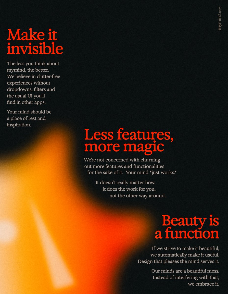
Our 3 product design principles for mymind: → To make things invisible we focus on two things: solving problems without introducing additional UI bloat (it's always easy to add another dropdown, button etc) AND reimagining design solutions from first principles instead of relying on established patterns. → Less features means we're not playing the game of shipping features just for the sake of it like everyone else. It's easy to fall into this trap and its a sure way to make your product worse. We have this habit to say NO more often than YES to make sure we stay on track. → We have to make it beautiful, there is no way around it. Beauty is a function as much as anything else. Anything we interact with on a daily basis should be beautiful to the eye, the ears and to the touch. Because why not?

how can anyone perfect anything?
We start to confuse convenience with joy.
Abundance with choice.
Designing something requires focus.
The first thing we ask is:
What do we want people to feel?
Delight.
Surprise.
Love.
Connection.
Then we begin to craft around our intention.
It takes time.
There are a thousand no’s for... See more
Apple, “Intention” | Insights and Inspiration from 50+ Great Examples
- Innovative; it must have creativity
- Useful
- Beautiful
- Easy to use
- Unobtrusive, modest
- Honest
- Timeless ; it won’t become outdated
- Doesn’t skip over any small details
- Environmentally friendly and doesn’t waste resources
- Not overly designed, “less is more”
Patricia Mou • vol.33: 15 Mindful Product Principles from Allen Zhang, Father of WeChat
Our goal is to get rid of as many pixels as possible, to leave you with the most essential and delightful ones