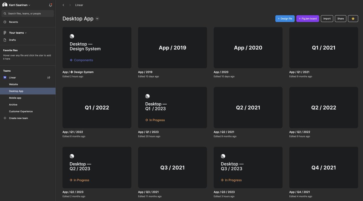
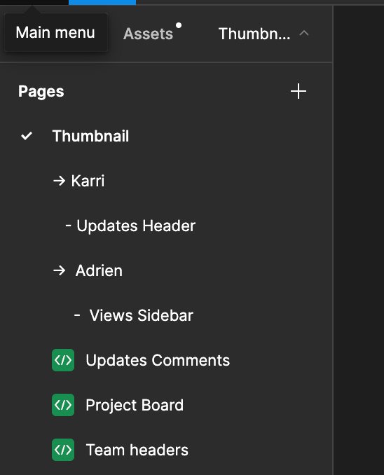
How we redesigned the Linear UI (part Ⅱ) In six weeks, we redesigned Linear’s UI. Discover the new UI and story behind it: http://linear.app/blog/how-we-redesigned-the-linear-ui… Show more
zenmushie and added
How we redesigned the Linear UI (part Ⅱ) - Linear Blog
Yehezkel Lipinsky added
How we redesigned the Linear UI (part Ⅱ) - Linear Blog
Yehezkel Lipinsky added
How we redesigned the Linear UI (part Ⅱ) - Linear Blog
Yehezkel Lipinsky added
With these realizations in mind, we approached our settings redesign like an onboarding experience. We created a settings “homepage” to show users what they can do with Linear and experiment with different functionalities.
Linear • Settings Are Not a Design Failure
sari added
Karri Saarinen • How we redesigned the Linear UI (part Ⅱ) - Linear Blog
Yehezkel Lipinsky and added
“The fundamental thing that Linear did differently was this idea of being highly opinionated,” she says. “They understood that, the truth is, most companies have no idea what the right software development process is,” Zhan says. “The subset who do would much prefer focusing on building their product than dedicating time to shaping this process—cu
... See moreKarri Saarinen • Designing for the Developers
sari and added