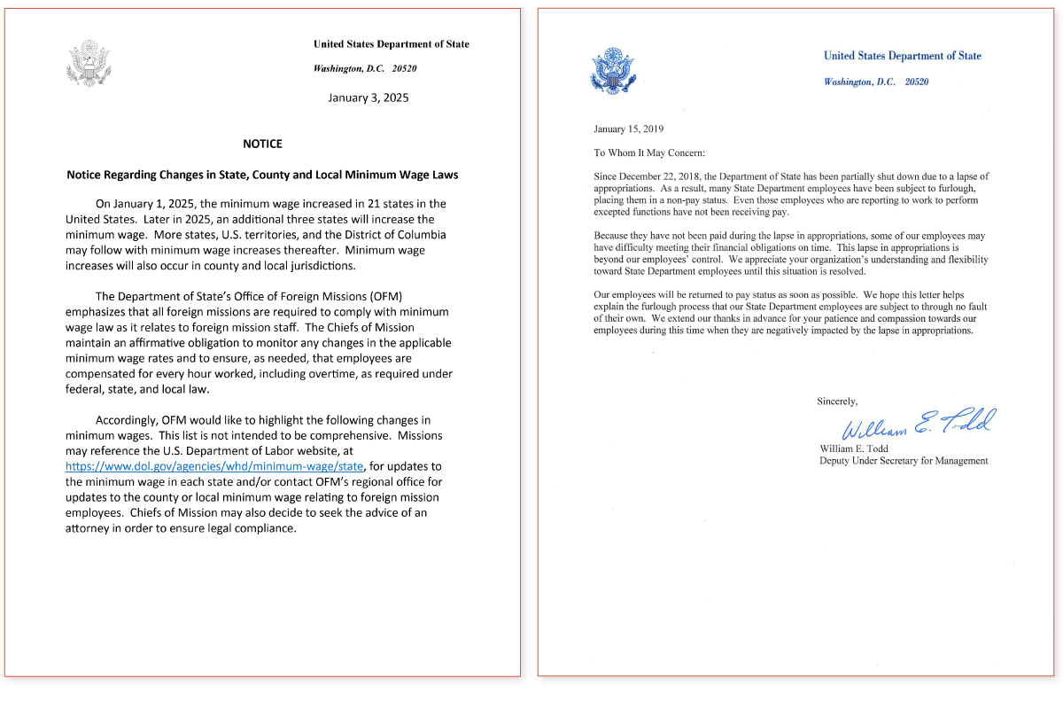
Times New American: A Tale of Two Fonts
“I myself am unequivocally guilty of this serif-as-humanity signaling,” wrote designer Keya Vadgama in a March Substack post, adding, “there is a certain irony in using distinctly human typographic touches to present something fundamentally non-human.”
Another example that comes to mind is this David Perell’s series of observations about “everything looking the same now”; in this case, company logos all moving to a narrow band of sans serif fonts. There are many possible explanations here, like homogenous design tools, but the Occam’s Razor answer is simply that these brands have global audiences... See more
Alex Danco • Have You Ever Seen a Goth Downtown?
we have to some extent been conditioned to think white, male and straight when we are discussing the ‘classics’. history is written by the victors and taste is dictated by the oppressor.