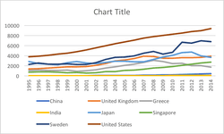
The last quadrant chart did so well I'm not sure I'll ever match it but I've given it a go! | Lucinda Bounsall
I like to think of data visualization as a story. The main character is the user, and we can go two ways. A story of charts and graphs might read a lot like a textbook; however, a story with context, relationships, interactions, patterns, and explanations reads like a novel.
Jeff Hammerbacher • Beautiful Data: The Stories Behind Elegant Data Solutions
Instead, though there was indeed an increase in public awareness of charts, the majority of people—as I wrote in my previous blog post—were only interested in those standard charts. I’ve found in recent years that my clients have started to shy away from anything too unconventional because they’re concerned about getting pushback from their... See more
what killed innovation?: the past decade of interactive graphics, a brief recounting - Shirley Wu


If I were starting out with zero Internet skills today, I'd learn to make beautiful, dynamic data visualizations.
📊 A few proof points:
1️⃣ r/dataisbeautiful is #33 top subreddit (20m subs). Easy place to grab inspo and experiment with your creations.
2️⃣ More... See more